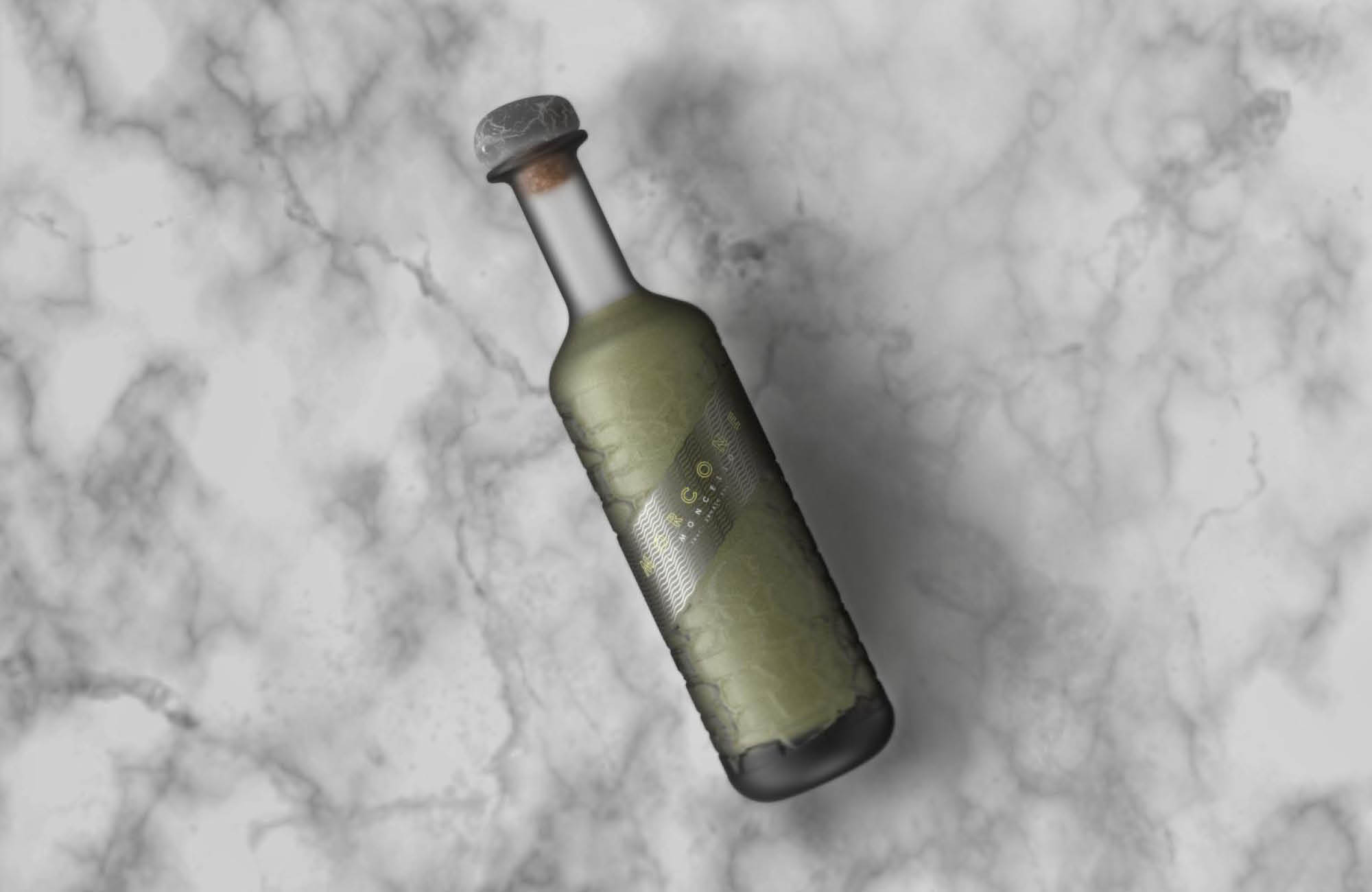
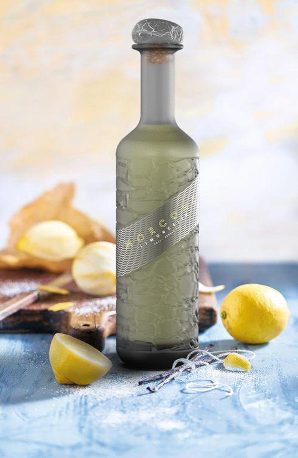
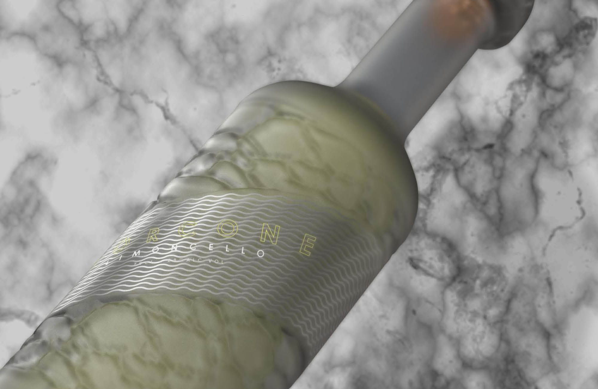
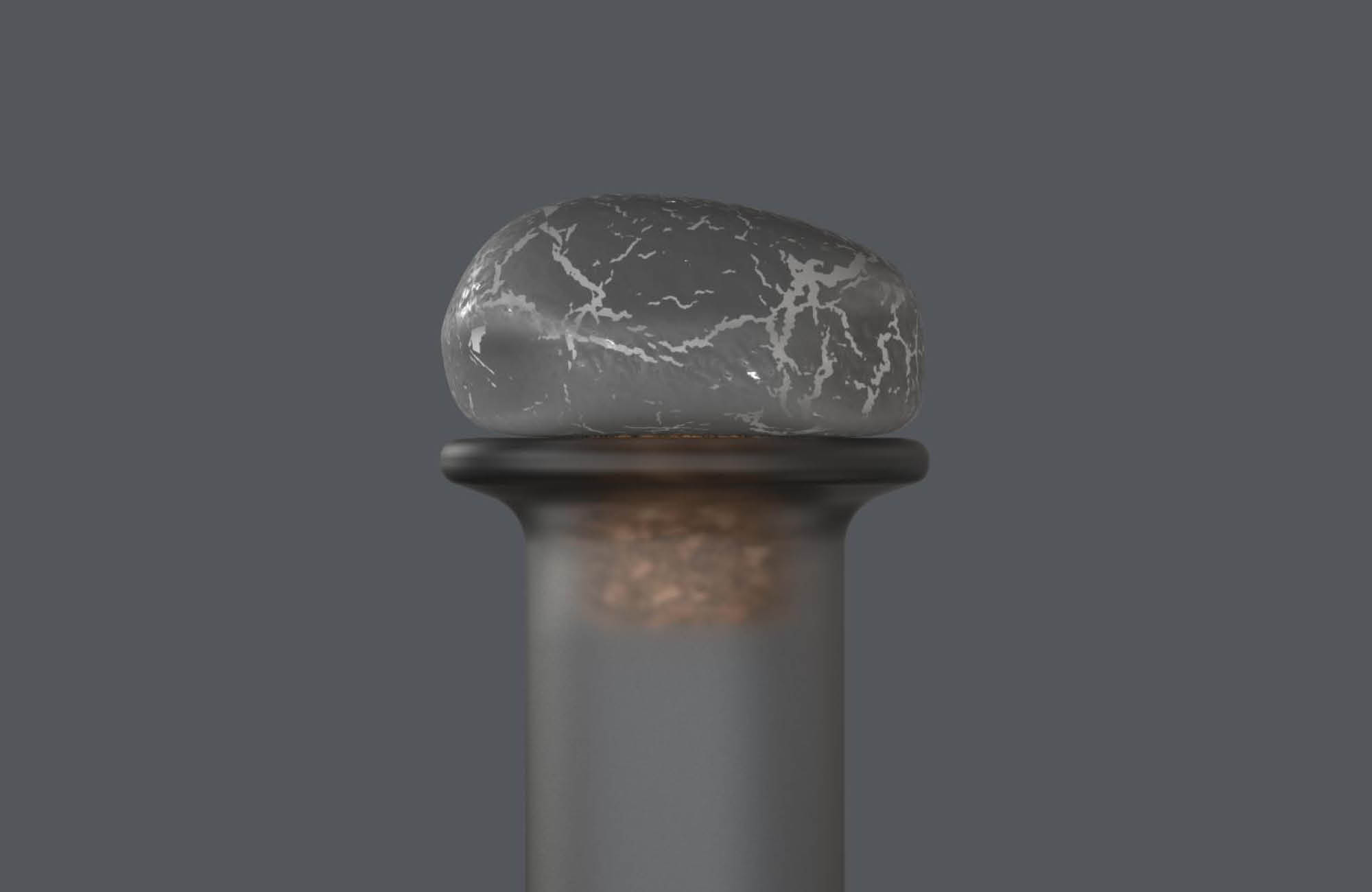
Morcone: New case study

Our Design Team STF are proud to offer a rendering service, bringing fresh conceptual designs to life.
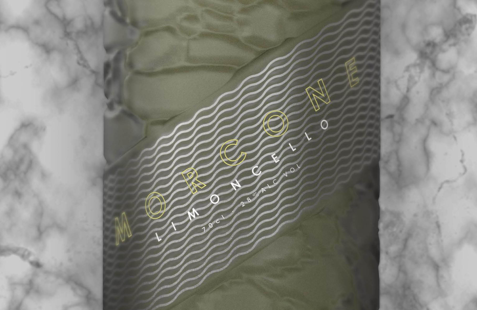
Morcone is one of our recent case studies, intended to add a much needed zest to a saturated Limoncello market.
The brand’s name, Morcone, is a nod to the small commune in the Italian region Campania, breathing old-world authenticity into the brand. Both brand and bottle encapsulate traditional Italian life by the Amalfi coast. The grey textured bottle is reminiscent of worn sea glass washed up on the shores and the stone-like embossed design is inspired by the masonry, symbolic of the coastal region. The grey and silver colour palette, most prominent on label and cork, continues the masonry theme. The closure provides a special touch with hand-crafted stoppers made to replicate the pebbles found along the shoreline, your own piece of coastal Italy. The name, Morcone, is printed in citrus yellow (this is Limoncello, after all) but remains modest against a glassy wave motif which hints at coastal tides.